- Published on
Analyzing iPhone Step Data
- Authors

- Name
- Ross Kippenbrock
Confession
My name is Ross, and I'm addicted to counting steps. The walking kind. This obsession entails frequently opening the counting app on my iPhone to watch the step count climb and ensure I'm getting over 10,000 (my mom says that's the magic number). Luckily, living in NYC makes the goal easily achievable on most days.
In this post I'll show you how I analyzed my iPhone step data using pandas timeseries and ggpy. I did all of my data-sciencing in Python using Rodeo, Yhat's IDE for data science.
Collecting Data
Like any legitimate data nerd, I wanted to be able to export my data for analysis outside my phone. The smart people over at Quantified Self Labs put out an app called QS Access that makes retrieving this data a cinch!
Here are a couple of screenshots of exporting the data.
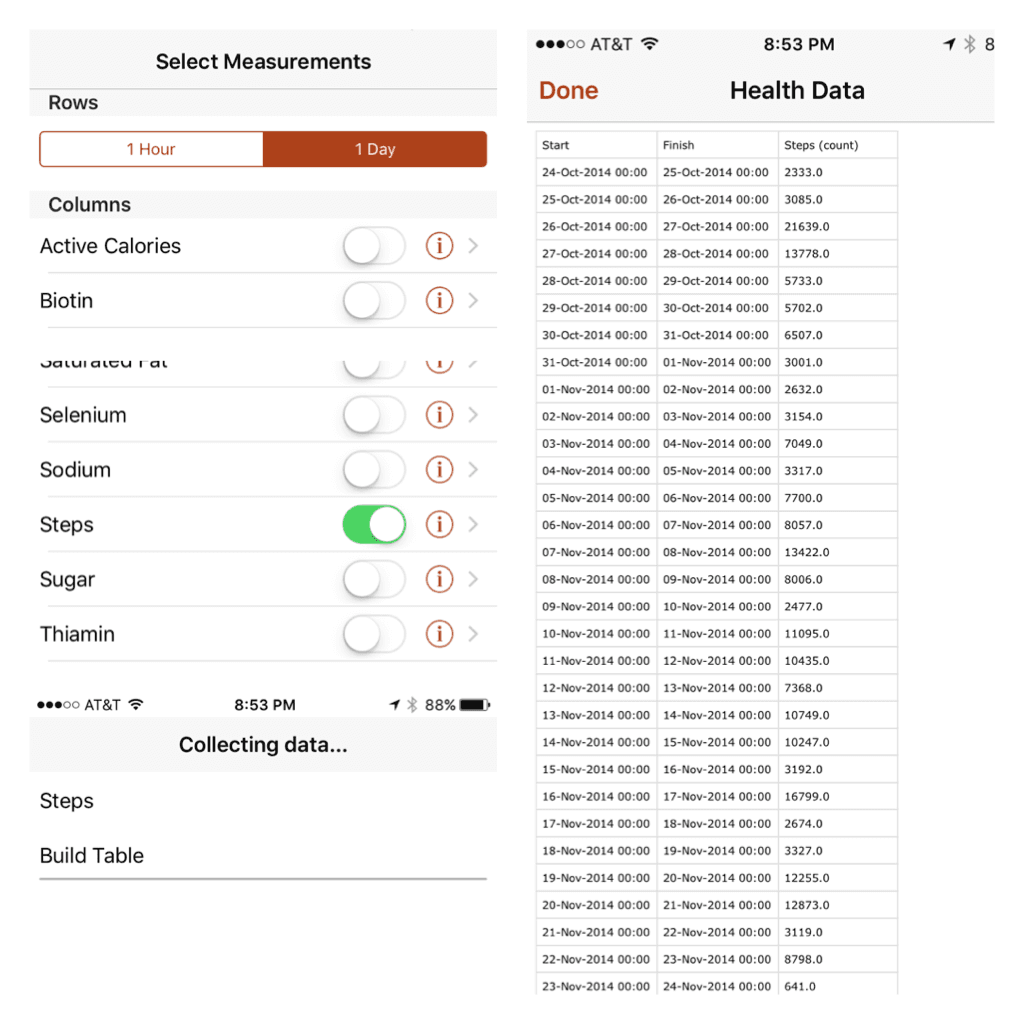
The QS Access app exports a CSV containing three columns: a start timestamp, a finish timestamp, and the steps (count) during that period. There's an option to produce rows of hourly or daily data. Why not start with hours and see how it goes - bigger data is always better, right?
TO THE DATAS!
Our analysis will draw on the time series tools built into pandas. When Wes McKinney started the pandas project, he was working for an investment management company and this industry relies extensively on time series analysis. As a result, pandas ships with comprehensive functionality in this area.
A couple other notes about importing this data while we're here.
First, we already know that we have time series data, so we can let pandas know by using the parse_dates parameter.
The end time data in the CSV isn't particularly interesting because we have the start time and know that we have hourly frequency so we can omit it with usecols.
Last, setting the start time (col 0) to be the index column gives a DateTimeIndex and will make our job easier later.
df_hour = pd.read_csv('health_data_hour.csv', parse_dates=[0,1], names=['start_time', 'steps'], usecols=[0, 2], skiprows=1, index_col=0)
# ensure the steps col are ints - weirdness going on with this one
df_hour.steps = df_hour.steps.apply(lambda x: int(float(x)))
df_hour.head()
type(df_hour.index)
type(df_hour.steps[1])
| steps | start_time |
|---|---|
| 2014-10-24 18:00:00 | 459 |
| 2014-10-24 19:00:00 | 93 |
| 2014-10-24 20:00:00 | 421 |
| 2014-10-24 21:00:00 | 1306 |
| 2014-10-24 22:00:00 | 39 |
Notice that the type of the start_time column: pandas.tseries.index.DatetimeIndex. This is due to setting the index column during the data ingest, and it gives us access to all sorts of goodies - resampling for one, as we'll see later.
Hourly Step Count
How about a quick plot to explore the data we have here.
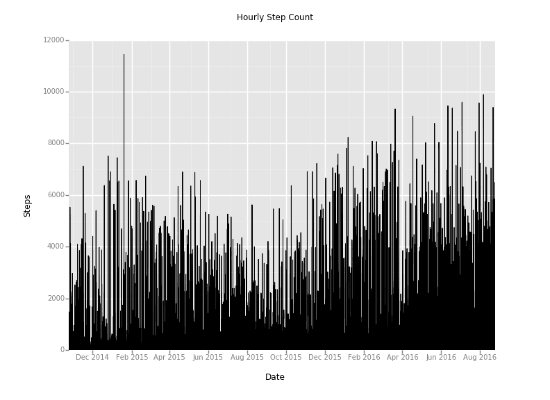
Yuck! That's a little too busy. How can we improve our visualization? I've got an idea - pandas has a function called resample that will allow us to aggregate the data over a longer duration.
More precisely, this is called downsampling when you reduce the sampling rate of a given signal. For this example, we will take the hourly data, and resample it on a daily, weekly, and monthly basis using the mean and sum aggregations.
Downsampling to Daily Step Count
Let's start with the daily totals (notice that you can pass the dataframe __index__ into the ggplot function):
df_daily = pd.DataFrame()
df_daily['step_count'] = df_hour.steps.resample('D').sum()
df_daily.head()
p = ggplot(df_daily, aes(x='__index__', y='step_count')) + \
    geom_step() + \
    stat_smooth() + \
    scale_x_date(labels="%m/%Y") + \
    ggtitle("Daily Step Count") + \
    xlab("Date") + \
    ylab("Steps")
print p
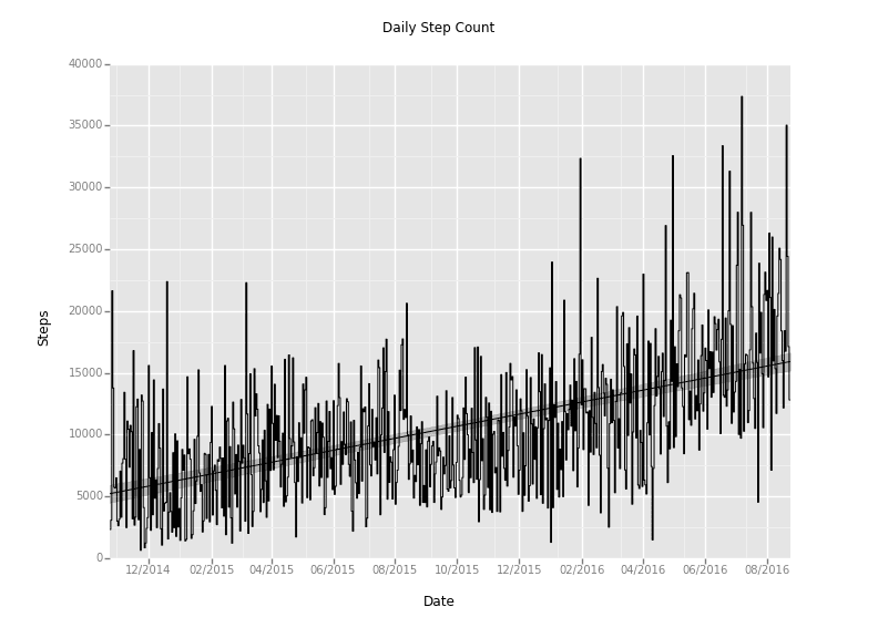
Ah-ha! We're getting somewhere now. That's a much more readable plot. And it looks like there's a nice upward trend (we'll get to that later).
Downsampling to Weekly and Monthly Step Count
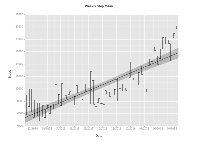
Armed with this, we're able to do weekly and monthly resampling easily as well. Just pass 'W' or 'M' into the resample function.
Because I'm most interested in the daily step total metric, we can start using an average aggregation function to get a daily average during the weekly and monthly samples (got to get those 10,000 a day!). That just takes changing the sum() function after the resample to a mean().
It looks like this:
df_weekly['step_mean'] = df_daily.step_count.resample('W').mean()
df_monthly['step_mean'] = df_daily.step_count.resample('M').mean()
Brief aside: Pandas can also do the opposite of what we just did; called upsampling. Take a look at the docs if you need that for your project.
Going (slightly) deeper

I'm curious if I'm getting more steps during the weekend than during the week. We can use the tab suggestions in Rodeo to take a look at the methods we have available on the DateTimeIndex.
There happen to be weekday and weekday_name methods, which sound useful. The former will give an integer corresponding to a day of the week, while the latter will give the string name of that day. After we make a new column with that info, applying a helper function to it can return a boolean value for if that is a weekend or not.
def weekendBool(day):
    if day not in ['Saturday', 'Sunday']:
        return False
    else:
        return True

df_daily['weekday'] = df_daily.index.weekday
df_daily['weekday_name'] = df_daily.index.weekday_name
df_daily['weekend'] = df_daily.weekday_name.apply(weekendBool)
df_daily.head()
| start_time | step_count | weekday | weekday_name | weekend |
|---|---|---|---|---|
| 2014-10-24 | 2333 | 4 | Friday | False |
| 2014-10-25 | 3085 | 5 | Saturday | True |
| 2014-10-26 | 21636 | 6 | Sunday | True |
| 2014-10-27 | 13776 | 0 | Monday | False |
| 2014-10-28 | 5732 | 1 | Tuesday | False |
ggplot has a stat_density plot available that's perfect for comparing the weekend vs. weekday populations. Check it out:
ggplot(aes(x='step_count', color='weekend'), data=df_daily) + \
    stat_density() + \
    ggtitle("Comparing Weekend vs. Weekday Daily Step Count") + \
    xlab("Step Count")
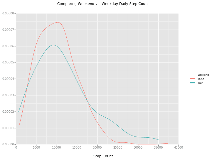
We can also group the data on this weekend_bool and run some aggregation methods to see the differences in the data. Have a look at my previous post on grouping in padas for an explanation of this functionality.
weekend_grouped = df_daily.groupby('weekend')
weekend_grouped.describe()

                  step_count     weekday
weekend
False   count    479.000000  479.000000
        mean   10145.832985    1.997912
        std     4962.913936    1.416429
        min      847.000000    0.000000
        25%     6345.000000    1.000000
        50%     9742.000000    2.000000
        75%    13195.000000    3.000000
        max    37360.000000    4.000000
True    count    192.000000  192.000000
        mean   11621.166667    5.500000
        std     7152.197426    0.501307
        min      641.000000    5.000000
        25%     6321.000000    5.000000
        50%    10228.000000    5.500000
        75%    15562.500000    6.000000
        max    35032.000000    6.000000

weekend_grouped.median()
            step_count  weekday
weekend
False          9742      2.0
True          10228      5.5
With an average of 11,621 steps on the weekend (and a median of 10,228) versus 10,146 (median = 9,742) on the weekdays, it looks like a slight edge goes to the weekends!
Now Trending
Let's get back to the upward trend.
I moved from Charlotte, NC, to New York City at the beginning of April to work as a software engineer at Yhat.
I'm curious what effect that this location change had on my daily step count. We can apply the same methodology as the weekend data to figure this out.
I'll just give you the good stuff:
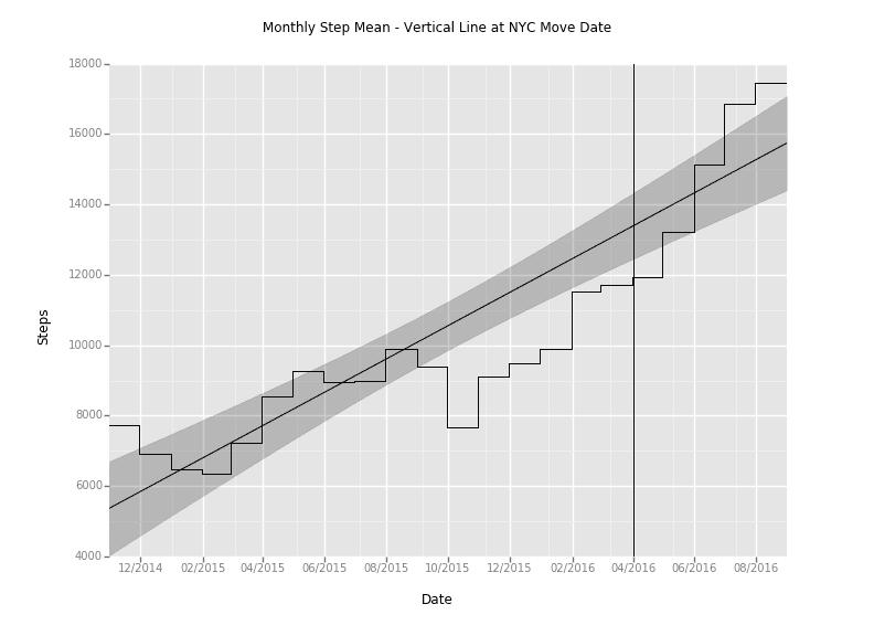
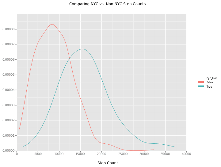
That plot makes it look like there's a significant change after moving to NYC. There are more variables than just the location change, like the fact that I just started running more seriously, which would add some skew, but controlling for that effect would require more data. Maybe for another post!
Final thoughts
Hopefully, this analysis was enough to get you started with checking out your step count data, using Rodeo to do some data-sciencing, and exploring the time series functionality of pandas! Have a look at my repo for this project if you want to check out the source.
Now, back to counting those steps.